
What Makes a Website Feel Refined Rather Than Empty
A pared-back website can create a strong first impression.
It can feel spacious, modern and considered. It can give a business room to breathe. But there is a fine line between a website that feels refined and one that simply feels unfinished.
White space alone does not create refinement. A quiet colour palette does not automatically build trust. A simple layout is only useful when the structure underneath is clear.
A refined website does not feel empty. It feels intentional.
Refinement Begins with Structure
Before the visual design, a website needs structure.
Visitors should be able to understand where they are, what the business offers and what to do next without having to work too hard. This is especially important for independent businesses, where the website often acts as the first serious point of trust.
A clear website structure usually answers:
Who are you?
What do you offer?
Who do you work with?
Why should someone trust you?
Where can they see your work?
How can they enquire?
If those answers are hidden, vague or scattered across the page, even the most beautiful website can feel weak.
Space Needs Purpose
Generous spacing can make a website feel elegant, but only when it supports the content.
Space should help people read. It should create rhythm, hierarchy and focus. It should guide attention from one idea to the next.
When space is used without purpose, a page can feel sparse rather than refined. The visitor may scroll through large sections without understanding what they are meant to notice.
Good spacing creates confidence. It says: this is the important part, and we are giving it room.
Typography Does More Than Look Beautiful
Typography plays a major role in how a website feels.
The right type system can make a brand feel refined, warm, structured, modern or expressive. But typography is not only about choosing a beautiful font. It is about hierarchy.
A useful website needs clear differences between:
main headings
section headings
subheadings
lead paragraphs
body copy
captions
buttons
navigation
When every piece of text looks similar, the page becomes harder to read. When the hierarchy is clear, the website feels more composed.
This is why typography is central to a refined website. It gives the content order.
Copy Should Be Clear, Not Overwritten
Many founders worry that their website copy needs to sound impressive.
In reality, clear copy is usually more effective.
A refined website should explain the business without overcomplicating it. It should help people understand the offer, audience and value of the work. It does not need to overpromise or use dramatic language.
Good website copy should feel:
specific
calm
direct
easy to read
aligned with the brand
commercially useful
The words should support the design. The design should support the words.
Visual Consistency Builds Trust
A website can quickly feel empty or disconnected when the visual language changes from section to section.
Consistency helps visitors feel that the business is organised, credible and intentional.
This includes:
consistent image treatment
clear layout rhythm
repeated button styles
aligned spacing
a controlled colour palette
recognisable typography
a consistent tone of voice
Trust is often built through small repeated signals. A refined website does not need to shout. It needs to feel coherent.
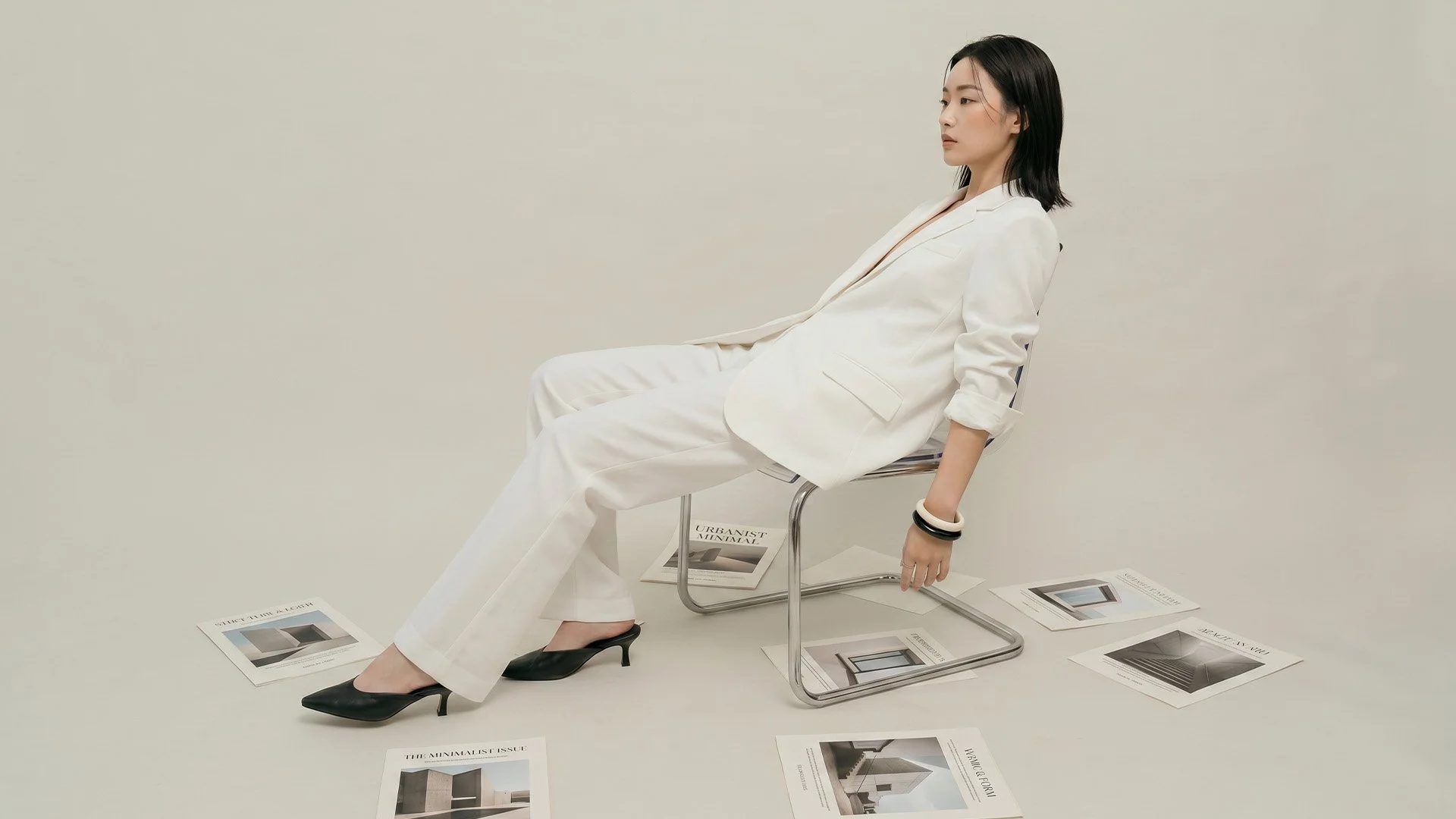
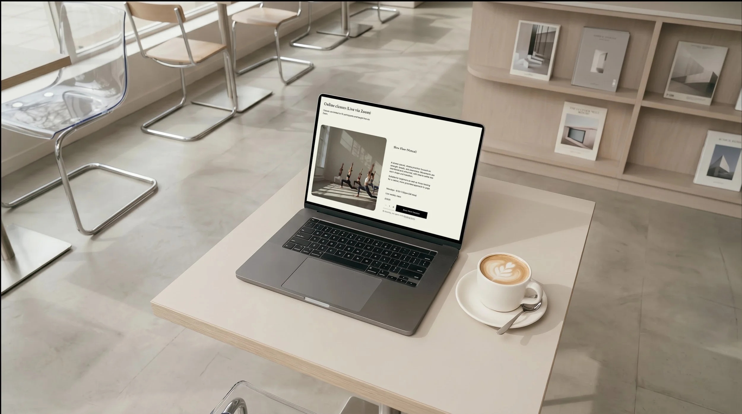
Imagery Should Support the Brand Atmosphere
Photography and image direction are often what make a pared-back website feel alive.
Without imagery, or with the wrong imagery, a minimal website can feel flat. The images should support the mood and message of the brand, not simply fill space.
For a considered business, imagery might show:
materials
details
hands at work
spaces
products
portraits
light and shadow
process
textures
brand applications
The key is relevance. Every image should help the visitor understand the business more clearly.
A Refined Website Still Needs a Clear Action
A beautiful website still needs to guide people.
If someone is interested, what should they do next? Should they enquire, view services, read a case study, join a mailing list or book a call?
A refined website should not hide the next step in the name of subtlety.
Calls to action can still feel elegant. They do not need to be aggressive. But they do need to be visible and clear.
Examples:
View Services
View Selected Work
Enquire
Read Insights
Start a Project
Direct language often works best.
Refinement Is the Result of Editing
A refined website is not created by adding more. It is usually created by editing carefully.
This means removing what does not support the visitor’s understanding and strengthening what does.
A strong website does not need every possible detail. It needs the right details in the right order.
That may mean simplifying the navigation, tightening the service descriptions, improving the homepage headline, creating stronger case studies or making the enquiry pathway clearer.
The aim is not to make the website look empty. The aim is to make it feel easier to understand.
Final Thought
A refined website is not defined by how little is on the page.
It is defined by how clearly each element works.
The structure, copy, typography, imagery, spacing and calls to action should all support the same purpose: helping people understand the business and feel confident taking the next step.
When a website is minimal, modern and pared-back, every choice matters.
That is what makes it feel considered.
Larima Studio designs Squarespace websites and brand identities for independent businesses seeking a clearer, more refined online presence.