
How Typography Changes the Way People Read Your Business
Typography is one of the quietest parts of a brand identity, but it is also one of the most powerful.
Before someone reads every word on your website, they have already formed an impression from the type. The scale, spacing, weight, contrast and rhythm all say something about the business.
Typography can make a brand feel refined, practical, warm, formal, expressive, modern or considered.
It does not simply carry the message. It shapes how the message is received.
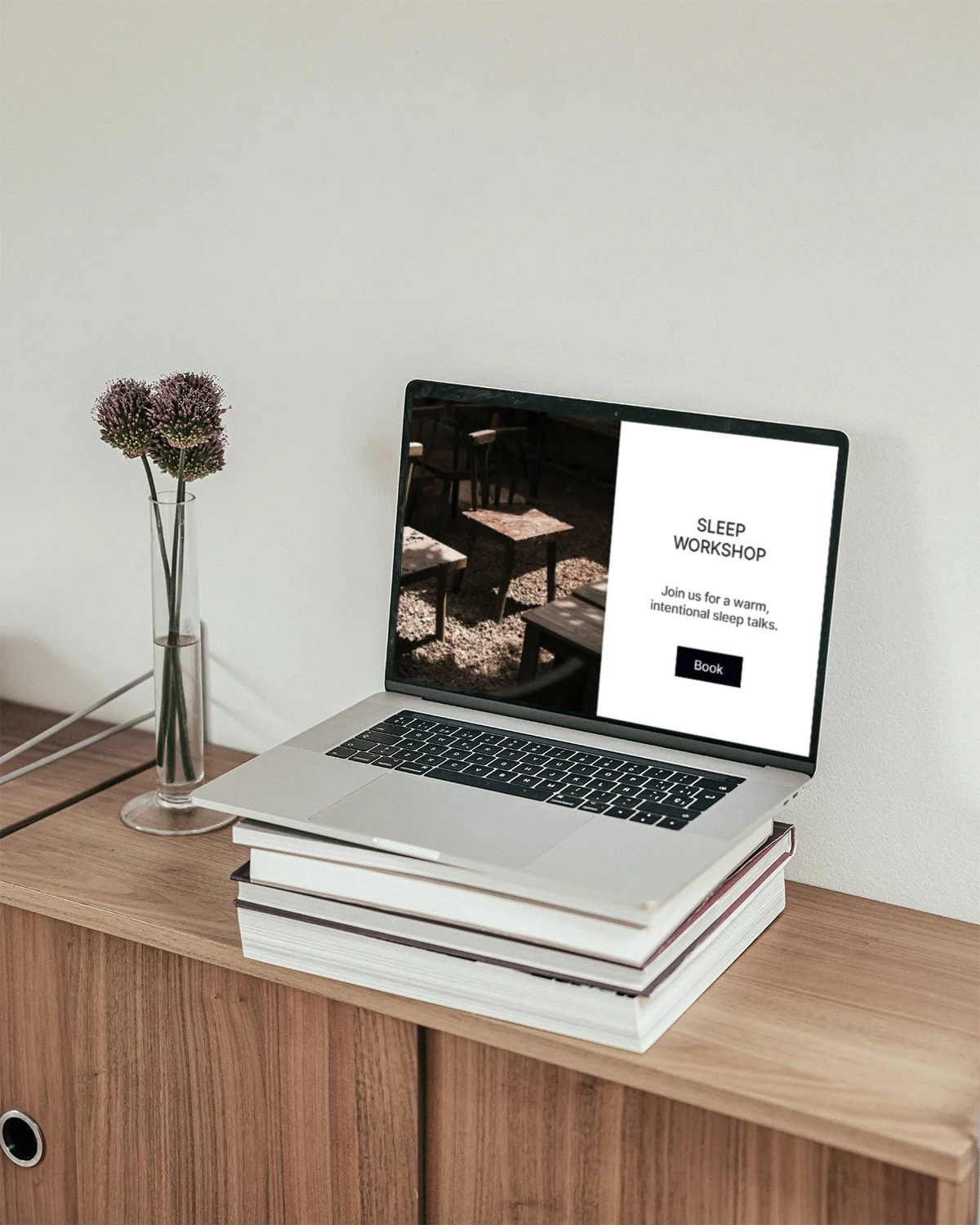
Type Creates a First Impression
When someone lands on your website, they may not consciously think about typography. But they will feel it.
Large, elegant headings may suggest confidence and refinement. Small, tight text may feel serious or difficult to approach. A soft typeface may feel warm, while a sharper one may feel more precise.
None of these choices are right or wrong on their own. What matters is whether they support the business.
A yoga studio, boutique hotel, independent consultant and lifestyle shop may all need different typographic approaches. The type should help the brand feel more like itself.
Typography Builds Trust Through Order
One of the most practical roles of typography is hierarchy.
Hierarchy tells people what to read first, what to scan, what to remember and where to go next. Without hierarchy, a website can feel visually flat and difficult to follow.
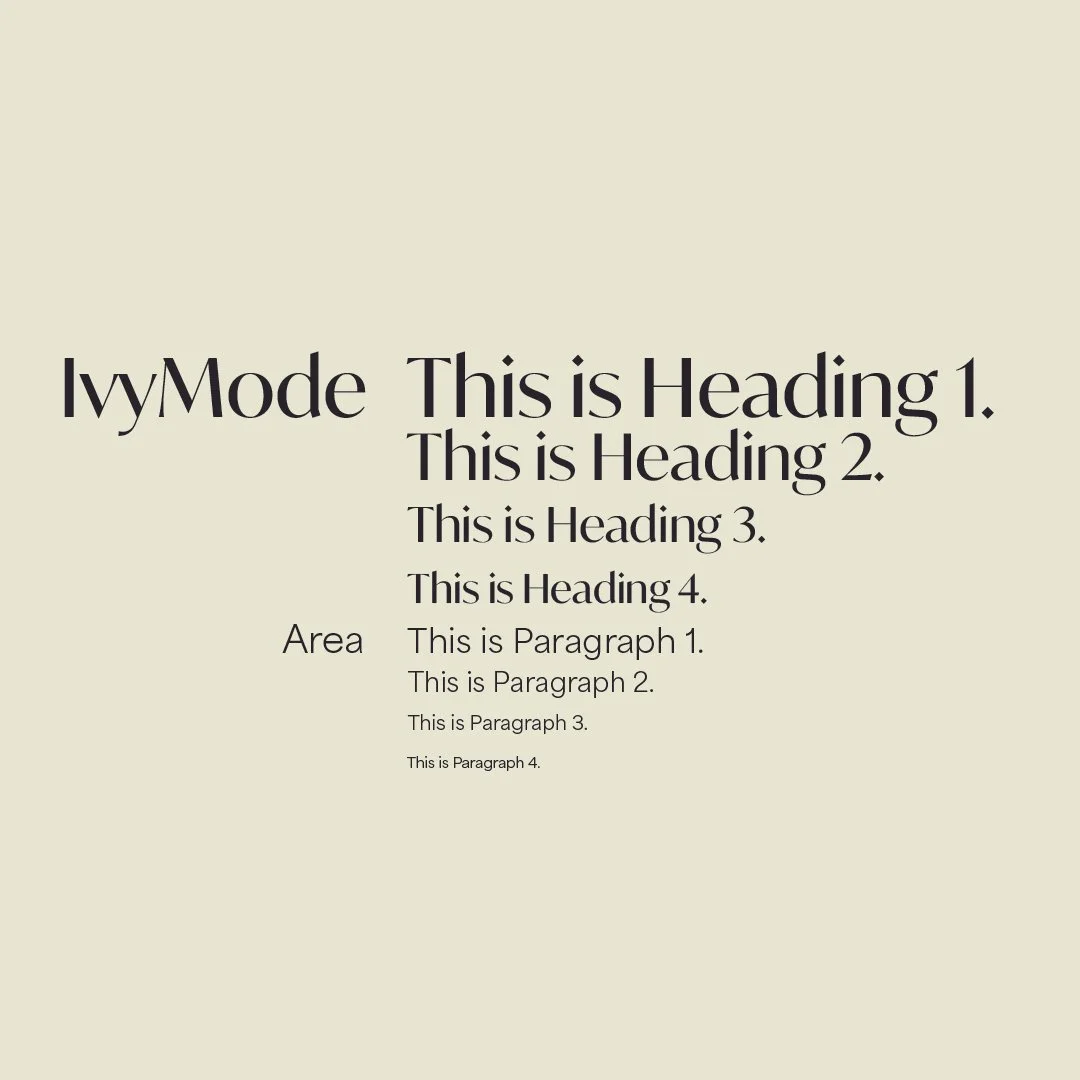
A useful type hierarchy includes:
H1 for the main page message
H2 for section headings
H3 for service names or article titles
H4 for labels and categories
P1 for lead paragraphs
P2 for standard body copy
P3 for supporting details or captions
When these levels are used consistently, the website feels more organised. Visitors do not need to work as hard to understand the page.
This creates trust.
The Same Words Can Feel Different in Another Typeface
Typography changes tone.
A sentence set in a delicate serif can feel thoughtful and refined. The same sentence set in a bold geometric sans-serif can feel direct and modern. Set it in a decorative font and it may feel expressive, but possibly less serious.
This is why choosing type is not just an aesthetic decision. It is a strategic one.
Your typography should support your brand’s personality, audience and commercial position.
For Larima Studio, the ideal typographic direction is minimal, modern and pared-back, but still distinctive. It should feel clear and refined without becoming cold or generic.
Spacing Affects How People Feel
Typography is not only about the typeface itself.
Spacing matters just as much.
Line height, letter spacing, margins and paragraph spacing all affect how easy the content is to read. If text feels too tight, the brand may feel rushed or heavy. If spacing is too loose, the page may feel disconnected or empty.
Good spacing creates pace. It gives the reader room to absorb the message.
For considered businesses, this is especially important. The website should not feel crowded. It should create a sense of clarity and ease.
Typography Helps Create Recognition
A brand becomes more memorable when its typography is used consistently.
This does not mean every piece of content should look identical. It means the brand should have a recognisable visual rhythm.
For example:
headlines may always use the same type style
service names may follow the same hierarchy
captions may have a consistent tone and scale
buttons may use the same styling
Instagram graphics may repeat the same type system
website pages may share a similar layout rhythm
Over time, this consistency helps people recognise the brand faster.
Recognition is not always built through a logo. Often, it is built through repeated visual behaviour.
Poor Typography Can Make a Good Business Look Unclear
Have you ever seen a website from the 90s which may have ignored these simple typography rules and resulted in sending ambiguos messages to the audiences?
A strong business can still appear uncertain if the typography is inconsistent or poorly handled.
Common problems include:
too many fonts
unclear heading sizes
body copy that is too small
poor contrast
awkward spacing
inconsistent alignment
buttons that do not stand out
captions that look like body copy
no clear difference between sections
These issues may seem small, but they affect how people experience the brand.
If the typography feels unclear, the business can feel unclear too.
Typography and Website Design Should Work Together
Typography should not be chosen separately from the website structure.
The type system needs to work across real content: homepage headlines, service descriptions, case studies, enquiry forms, article titles, captions and buttons.
A beautiful font is not enough if it does not support usability.
For a Squarespace website, this becomes even more important. The typography needs to be flexible, readable and consistent across desktop and mobile.
A considered website should feel refined at every size.
Final Thought
Typography changes the way people read your business because it affects both meaning and feeling.
It tells people what matters. It creates order. It shapes tone. It builds recognition. It helps your brand feel more consistent and trustworthy.
For independent businesses, typography is not a finishing touch. It is part of the foundation.
When handled with care, it can make your brand feel clearer before a single conversation begins.
Larima Studio creates brand identities and Squarespace websites with careful attention to typography, structure and visual clarity.