
Why a Minimal Brand Still Needs a Strong Point of View

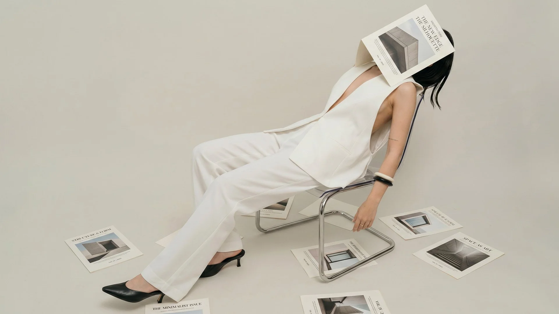
Minimal design is often misunderstood.
At first glance, it can look simple: fewer colours, more space, restrained typography, quiet imagery and a pared-back layout. But a minimal brand is not strong because it has less. It is strong when every choice has a clear reason behind it.
Without a point of view, minimal design can quickly become plain. It may look clean, but it does not say very much. It may feel tasteful, but not memorable. It may appear calm, but not necessarily trusted.
A considered brand needs more than restraint. It needs direction.
Minimal Does Not Mean Empty
A minimal brand still needs to communicate.
It needs to tell people who you are, what you offer, what kind of experience they can expect and why they should trust you. If the design is too stripped back without enough structure, people may admire the look but still feel unsure about the business behind it.
This is especially important for independent businesses. You may not have a large team, a long history or a big advertising budget. Your brand identity and website need to work harder. They need to create confidence quickly.
Pared-back design can be powerful, but only when it helps people understand you faster.
A Point of View Gives the Brand Shape
A strong point of view does not need to be loud.
It can be quiet, precise and considered. It may show through the typography you choose, the way your website is structured, the tone of your copy, the pace of your layout, or the atmosphere of your photography.
For example, two businesses may both use a neutral colour palette and minimal typography. One may feel clinical and distant. The other may feel refined, warm and trustworthy. The difference is not only in the style. It is in the intention behind the style.
A point of view gives your brand a reason to look the way it does.
The Role of Structure
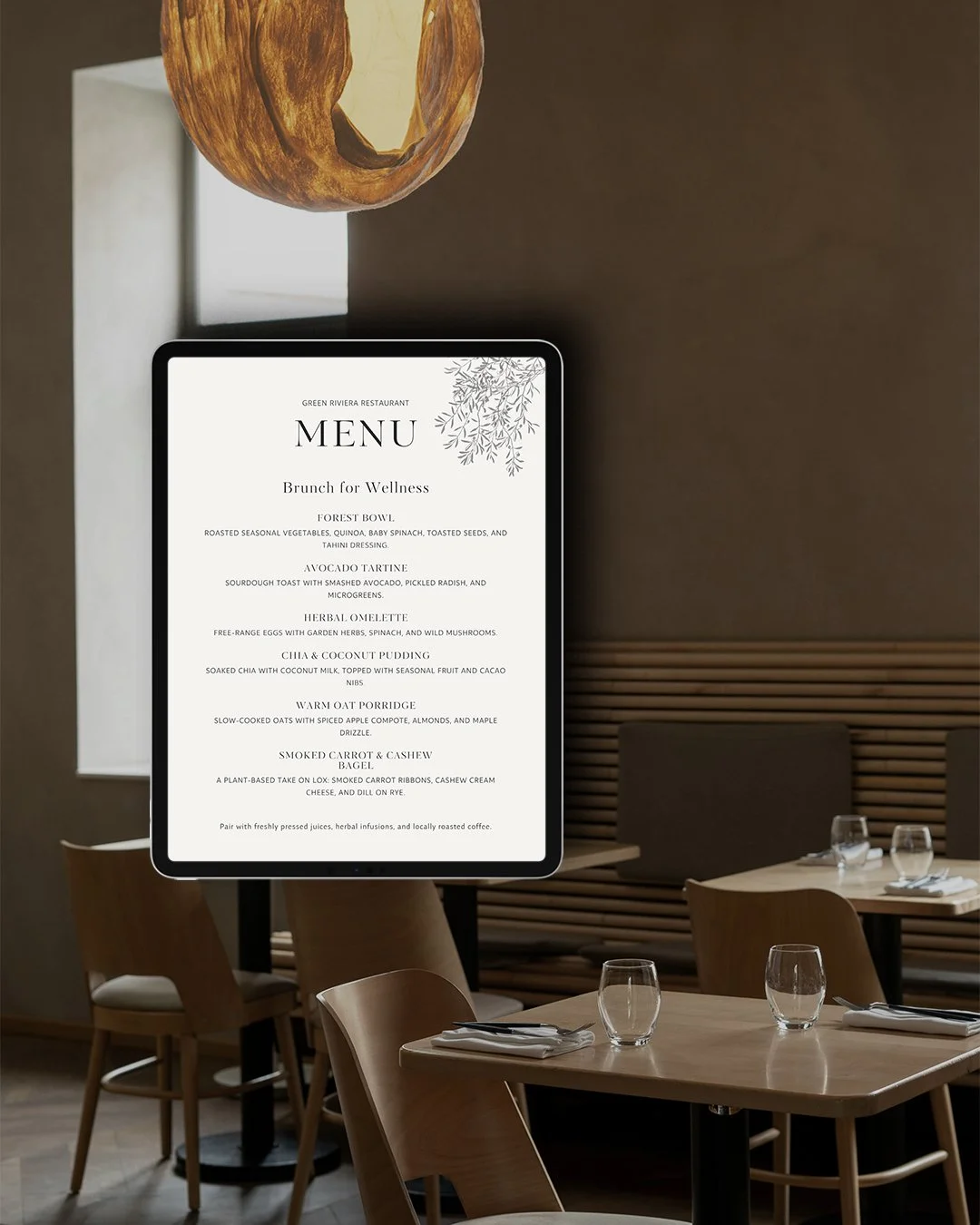
Minimal design relies on structure.
When there are fewer visual elements, everything matters more. The spacing, type size, image crop, colour contrast, page hierarchy and wording all carry more weight.
This is why a minimal brand identity should never be reduced to a logo alone. A useful identity system needs:
Logo system
Typography hierarchy
Colour palette
Layout direction
Photography approach
Brand applications
Website structure
Clear messaging
When these elements work together, the brand feels composed. When they are missing, the brand can feel unfinished.
Why This Matters for Your Website
Your website is often where people decide whether your business feels credible.
A minimal website may look refined, but if the structure is unclear, the experience becomes difficult. Visitors still need to know:
What do you offer?
Who is it for?
Why does it matter?
What makes your approach different?
What should they do next?
Good website design does not only create a beautiful first impression. It guides people clearly from interest to trust.
A pared-back website should still have a clear journey.
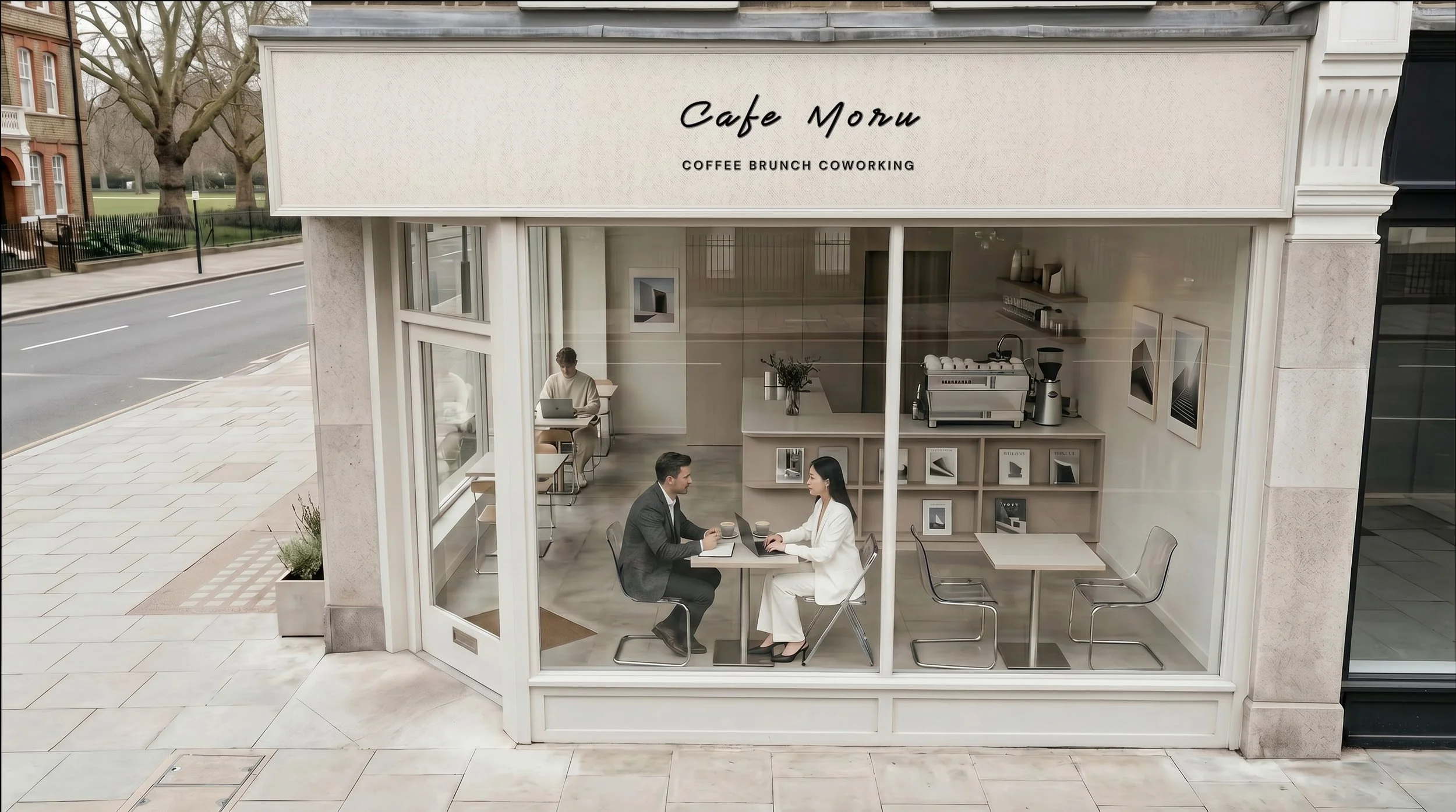
Visual Restraint Should Create Recognition
The aim of minimal branding is not to remove personality. It is to refine it.
A strong minimal brand should still feel recognisable. It should have a consistent rhythm, a clear visual language and a way of appearing that feels specific to the business.
This can be created through small but deliberate choices:
a distinctive type pairing
a consistent use of space
a particular photography style
a restrained but recognisable colour palette
a repeated layout system
a specific tone of voice
Recognition often comes from repetition. The more consistent your brand becomes, the easier it is for people to remember you.
A Considered Brand Feels Clearer
At Larima Studio, we believe minimal design works best when it is supported by strategy.
Before shaping the visual identity, we look at the business behind it: the audience, offer, tone, positioning and the role the brand needs to play. This allows the design to feel purposeful rather than simply attractive.
A minimal brand should not just look good. It should help people understand the quality, intention and direction of your business.
That is where clarity begins.
Final Thought
A minimal brand still needs a strong point of view because simplicity alone is not enough.
The most considered brands are not empty. They are edited. They know what to say, what to show and what to leave out.
When minimal design is supported by structure, clarity and intention, it becomes more than a style. It becomes a way for your business to be recognised, understood and remembered.