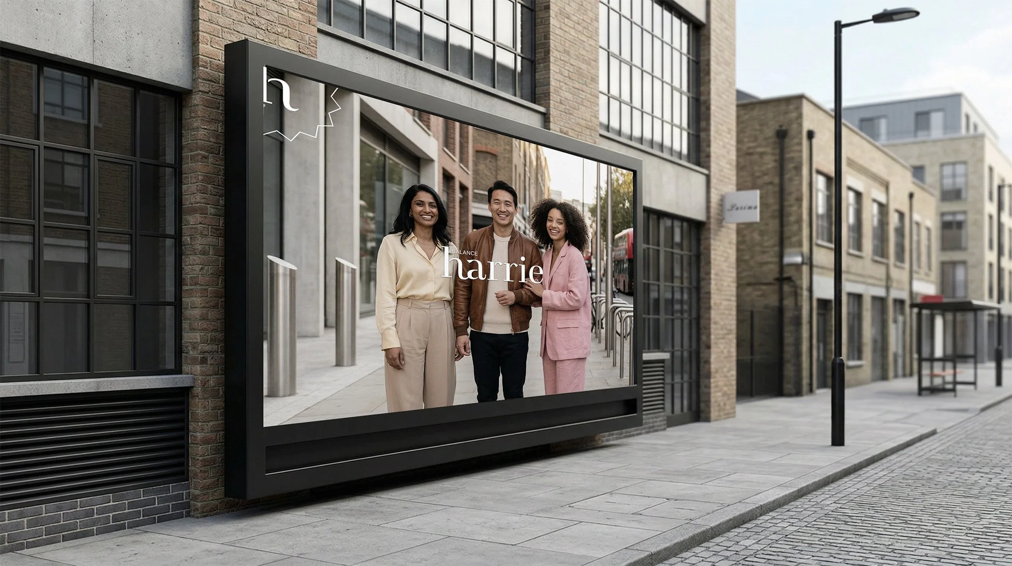
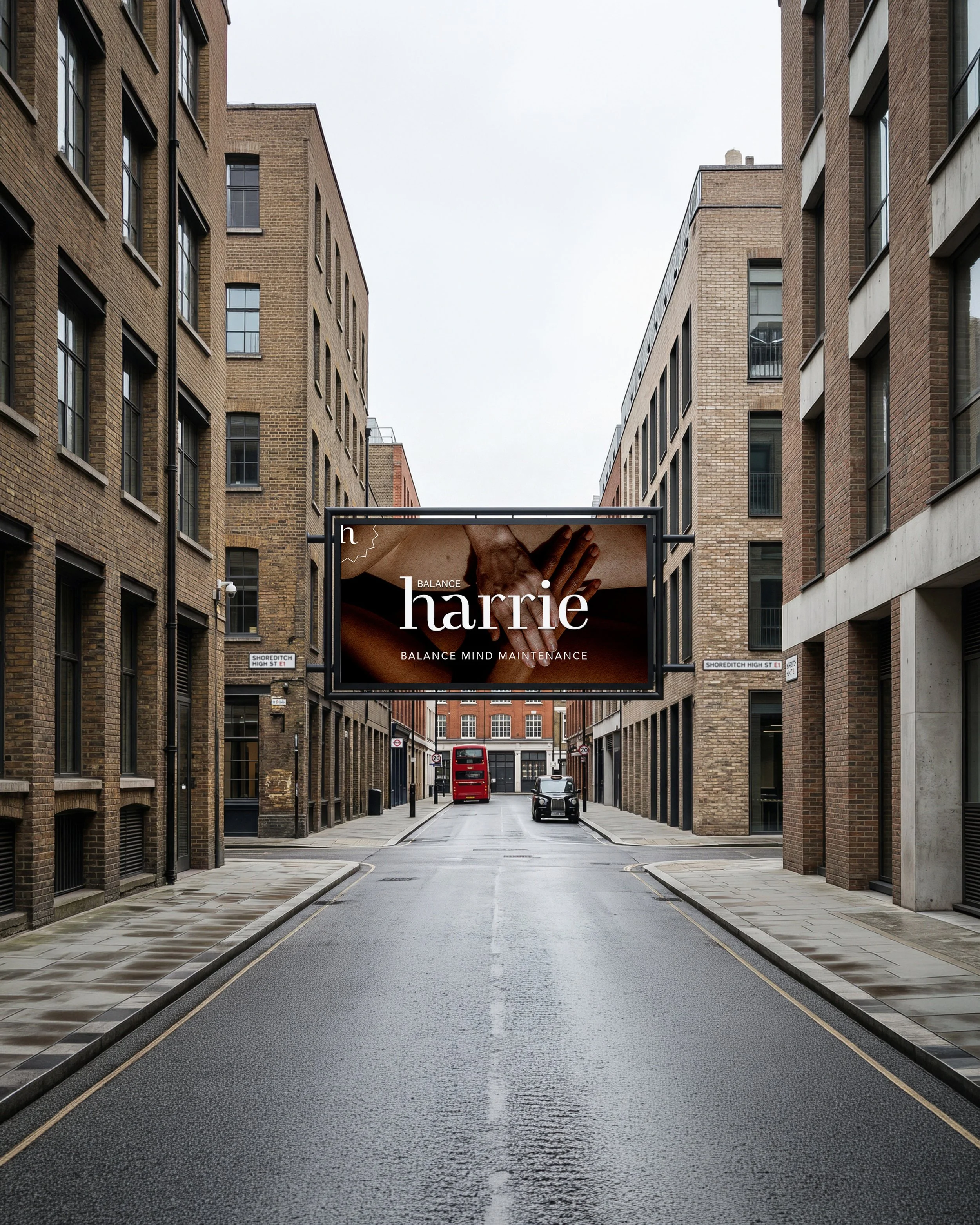
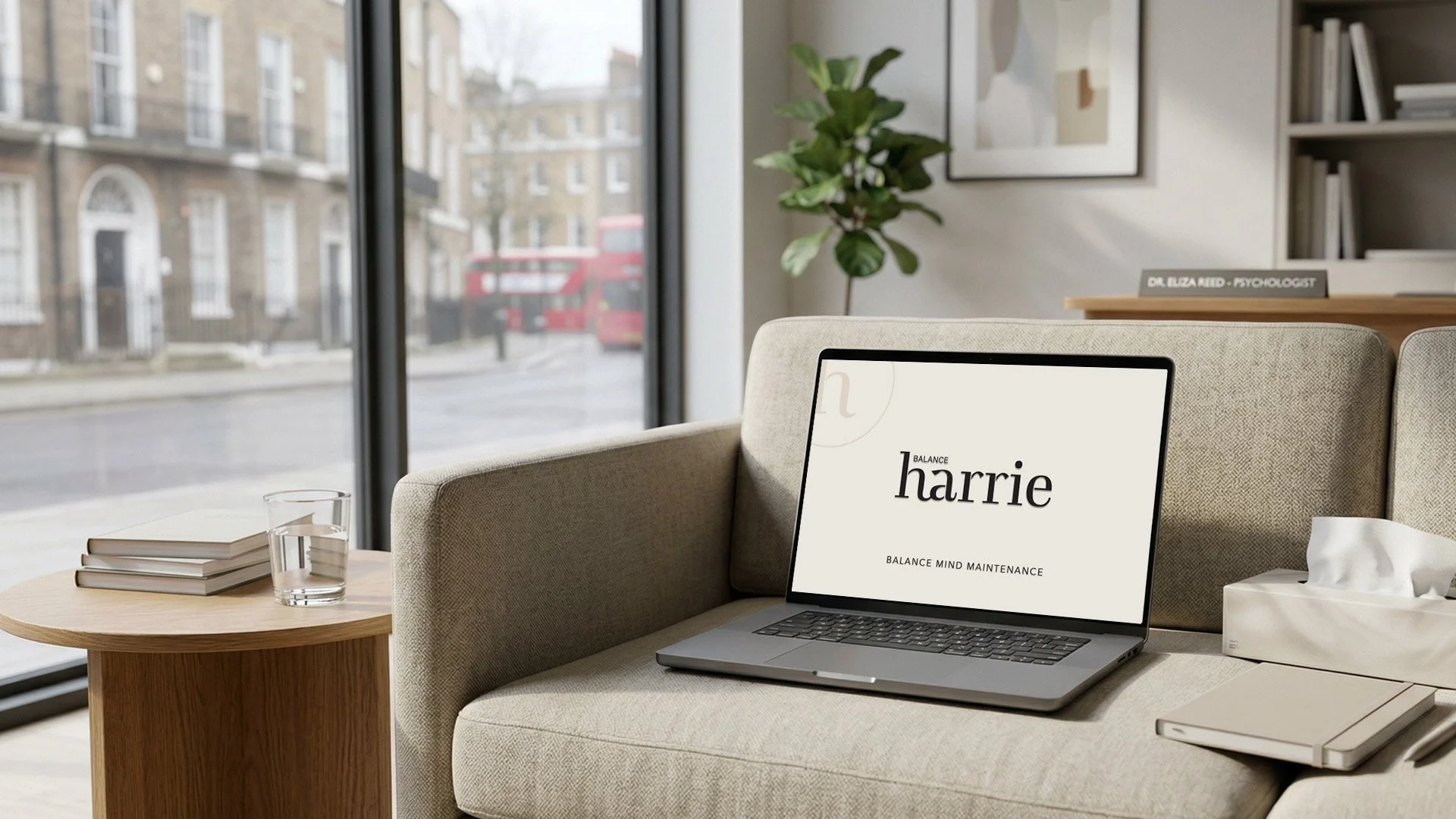
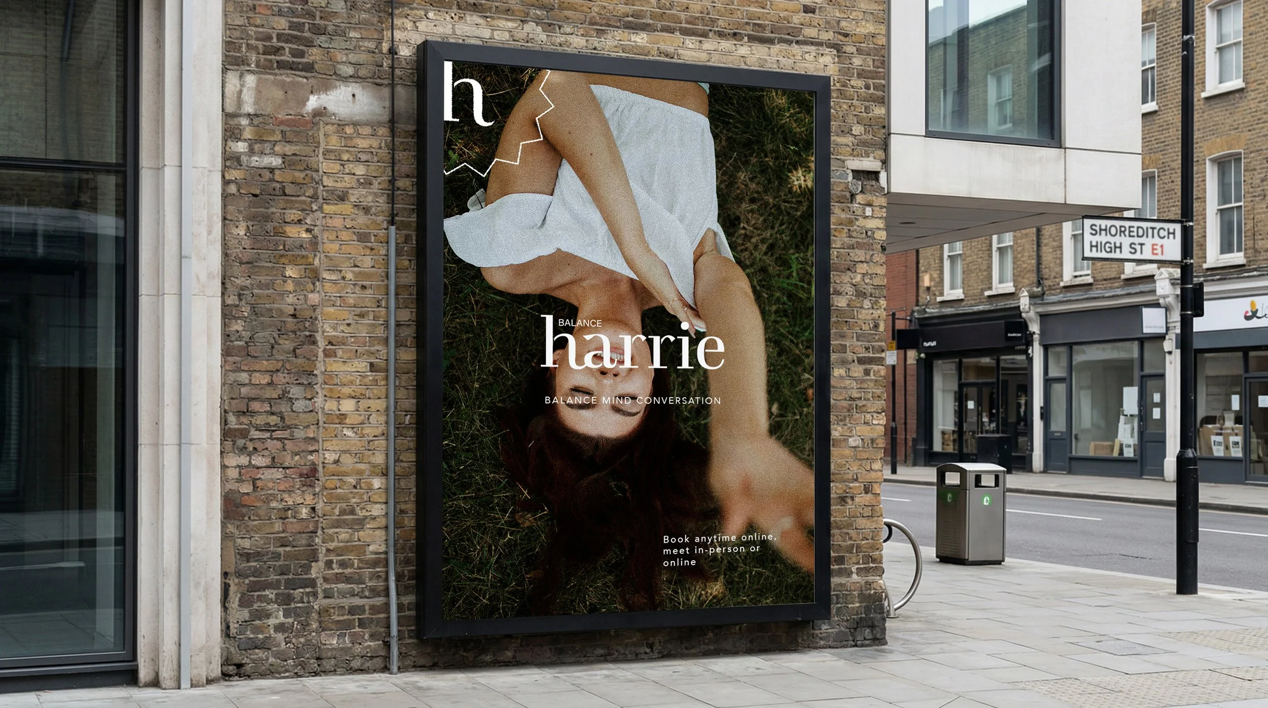
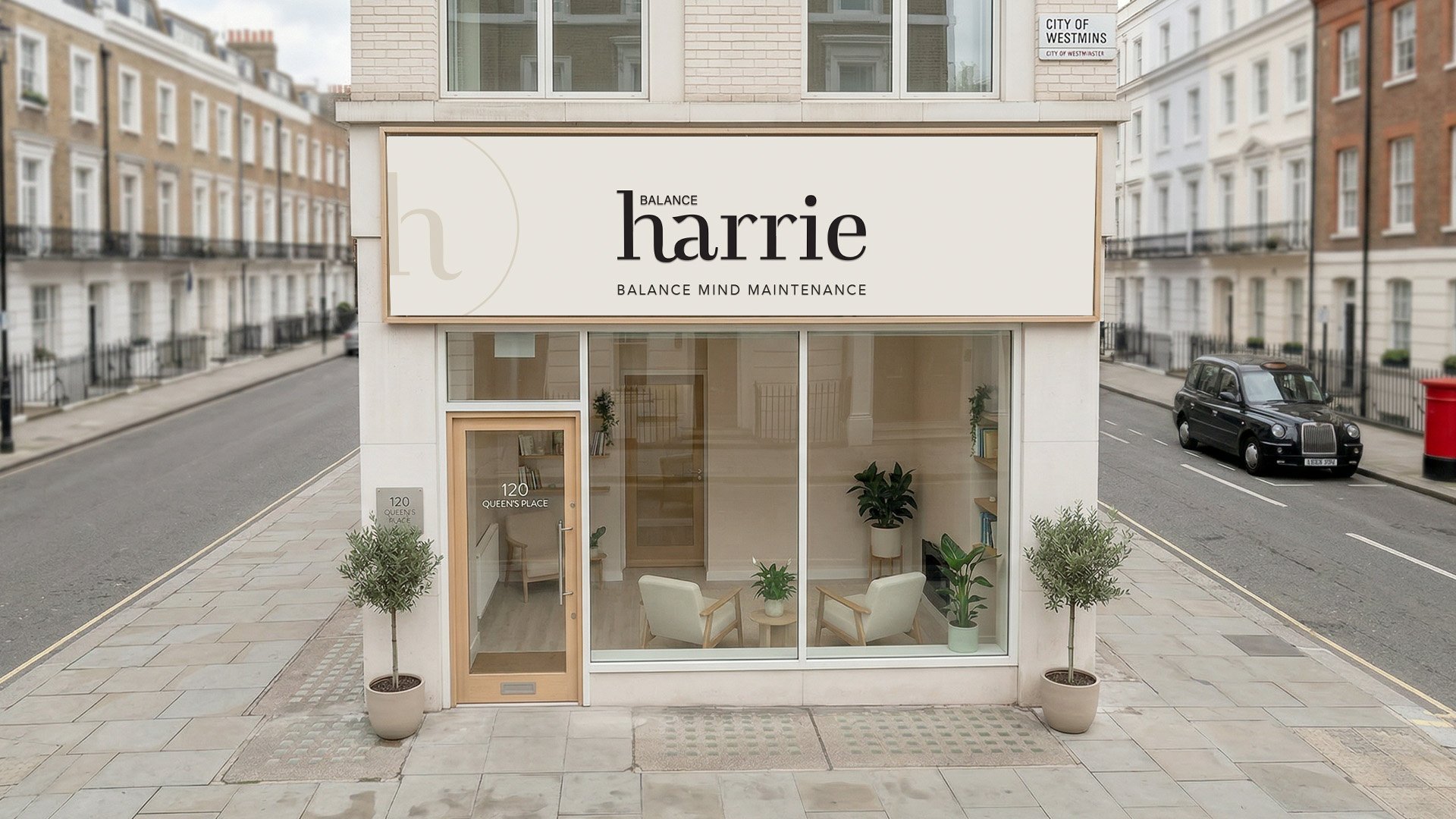
Harrie Balance
A considered identity for a London-based psychology practice, shaped to reflect confidentiality, care, and a sense of calm presence.
Industry
Psychology & Wellbeing
Brand concept
Creating a sense of calm, clarity, and trust within a considered therapeutic space
Project
Brand identity design & creative direction
The Challenge
The brand needed to communicate trust, professionalism, and a sense of ease — without feeling overly clinical or generic.
Like many therapy and counselling practices, there was a tension between being approachable and maintaining credibility. The visual presence felt undefined, making it difficult for the brand to express its values clearly or stand apart within a sensitive and saturated space.
There was also a deeper question beneath the surface:
how should the brand make people feel before a first interaction even begins?
The Approach
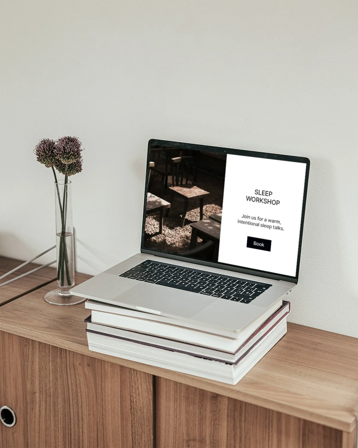
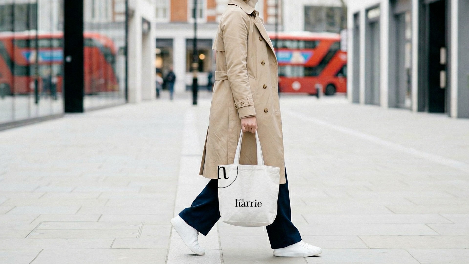
The direction focused on creating a calm and structured identity — one that feels human, considered, and quietly confident.
We shaped the brand around clarity and emotional sensitivity. Typography was selected to feel balanced and composed, while spacing and layout introduced a sense of pause and breathing room.
Rather than relying on typical wellness cues, the approach was to refine what was essential — allowing the brand to communicate through restraint, tone, and consistency.
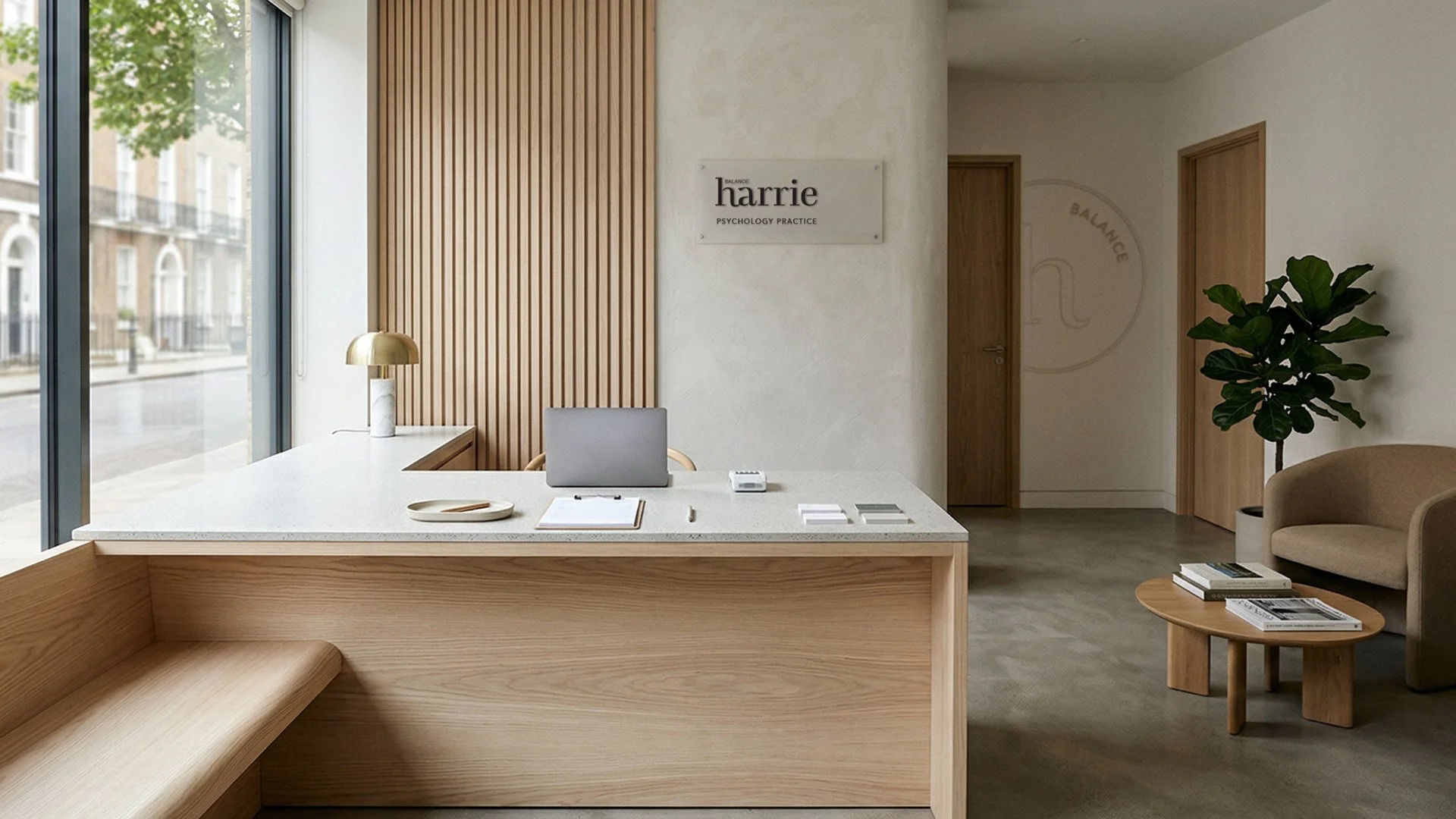
The result is a visual identity that supports the experience the practice aims to offer:
a space where people feel understood, held, and at ease.
The Result
The brand now presents itself with a clearer sense of direction and presence.
It feels grounded, professional, and approachable — without needing to overstate itself.
More importantly, the identity aligns with how the practice wants to be perceived, creating a stronger connection between what it offers and how it is experienced visually.
A considered identity doesn’t just represent a business.
It shapes how it is understood.