The Role of Colour in Building Client Trust
At Larima Studio, we work with wellness and creative businesses across the UK to design brand identities that feel calm, intentional, and professional. Our approach weaves together minimal design and a deep understanding of how people experience visuals — so your brand conveys trust, clarity, and connection at every aspect of your business.
Colour is one of the earliest design decisions — and also one of the most influential. It’s not just decoration. Colour carries psychological and emotional weight: tone, contrast, and pairing all shape how clients perceive your values, personality, and credibility.
In wellness and creative industries, where emotional resonance and trust are crucial, choosing colour with purpose can transform how clients feel about your brand.
1. The Psychology of Colour and Trust
Research in marketing and psychology shows that people make rapid judgements about brands, and colour plays a major role in that perception. Studies suggest that between 62% and 90% of snap judgements about products or brands are based on colour alone — depending on the context and individual differences (Singh, S. (2006), Impact of Color on Marketing, Management Decision, Emerald Insight).
Colour psychology helps explain how colour impacts human behaviour and brand trust — not through universal “rules,” but through learned associations and emotional responses (Help Scout: The Psychology of Color in Marketing and Branding).
When developing palettes, we explore not just which tones appear pleasing, but how they feel together within your brand environment — on screen, in print, and in the spaces you occupy. A balanced palette builds subconscious trust through harmony.

2. Colour Associations in Wellness and Creative Brands
Different colour families communicate different emotional qualities:
Blue often conveys calm, stability, and reliability — common in health, wellness, and corporate settings.
Green represents renewal, balance, and connection to nature — ideal for holistic, sustainable, or organic brands.
Neutrals such as white, grey, or beige signal simplicity and sophistication, letting other elements breathe.
Earth tones (warm browns, soft terracotta, muted olive) evoke groundedness and authenticity.
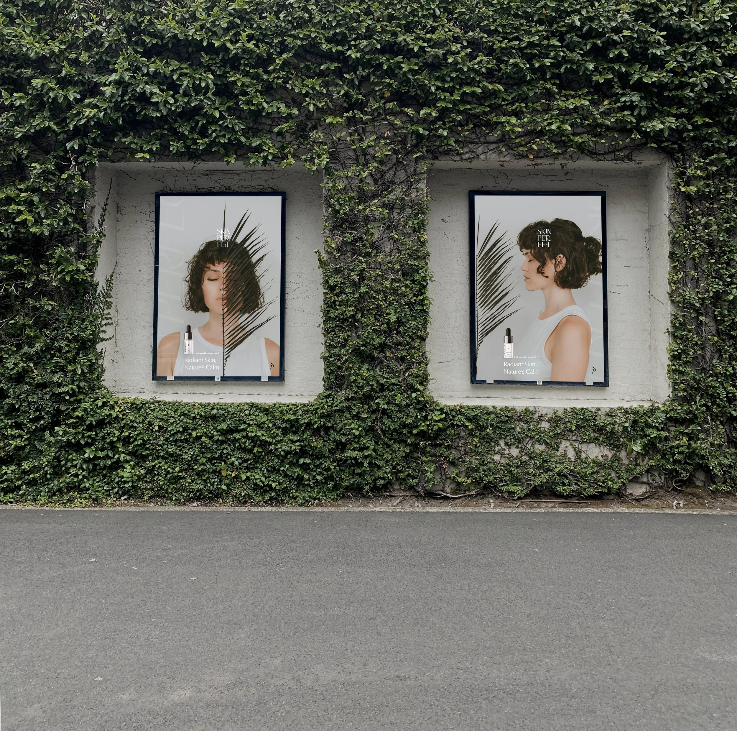
In the UK, where audiences tend to value understatement and sincerity, softer and more natural palettes often resonate better than bright or saturated colours. They feel timeless, human, and composed.
Our process begins with observation — collecting references from textures, light, and materials around your environment. These real-world tones form the foundation for a colour palette that feels both authentic and emotionally aligned.

3. Balancing Emotion and Function
Effective branding balances emotion with usability. Colour should feel right and function intuitively. Overly complex palettes can overwhelm; minimal systems create clarity and rhythm.
From a usability standpoint, colour guides attention and creates hierarchy. Accent tones highlight key actions or information, while contrast ensures accessibility and readability — fundamental principles supported by research on web reading behaviour (Nielsen Norman Group: How Users Read on the Web).
We design colour systems that work both visually and practically — guiding the eye naturally through each touchpoint while maintaining emotional coherence.

4. Consistency Builds Recognition
Consistency in colour use fosters familiarity, and familiarity builds trust. Seeing the same palette across your website, social channels, and physical materials helps audiences recognise your brand instantly.
Brand consistency has measurable business impact: companies presenting a consistent brand image see, on average, up to 23% higher revenue (Marq (formerly Lucidpress) State of Brand Consistency Report, 2019).
Our design guidelines ensure that every application — digital or print — feels unified, so clients always experience your brand as cohesive and reliable.
5. Cultural and Contextual Sensitivity
Colours carry different meanings across cultures. For example, while white symbolises purity and simplicity in Western design, it represents mourning in parts of East Asia. In a multicultural context such as the UK, awareness of these differences helps brands remain inclusive and respectful.
When creating palettes, we test combinations across lighting conditions, devices, and demographics to ensure they evoke the same emotional response universally — designing not only for aesthetics but for empathy.

Final thoughts
Colour is one of the most subtle yet powerful forms of communication a brand has. It influences trust, emotion, and memory long before words do.
Minimalism in design does not mean removing colour — it means using it with care and clarity. Each tone should serve a purpose: to express your values, create connection, and enhance the calm, confident presence of your brand.
At Larima Studio, we approach colour with deliberate intention. Each palette we craft is designed to evoke trust, reflect authenticity, and create harmony between brand and audience.
If your current colour palette no longer represents your business or feels disconnected from your message, we’d love to help you rediscover your visual balance. Take the first step and send us an email.